My Definition of Portrait:
A portrait is a painting or a sculpture or a photograph of a person. An artist will illustrate their own version/interpretation/representation of a person. The painting/photograph will or may include parts of the person that they are painting or photographing. The purpose of the portrait is to express the different facial or body expressions of the person. You as the viewer of the painting/photograph can gather your own thoughts and feelings from the painting.
Primary Research – Marcela Gutiérrez:

Marcela Gutiérrez is a painter, fashion designer and fashion illustrator from Miami, Florida. Born in 1978, she was raised in Guatemala where she took in interest in sketch illustration. Continuing with her career she enrolled in architecture, where she followed up her sketching by painting portraits of people. Marcela then interned for Marc Jacobs and Nylon Magazine in NYC. She then graduated from university as a fashion designer in which popular fashion designers Alexander McQueen and John Galliano expressed their interest in her work and seized the opportunity to work with her. She has had many highlights throughout her career. One of her most popular highlights to date is when she was given the opportunity by R&B superstar Beyonce to do an illustration for a Beyonce commercial TV sport. Beyonce also gave her the opportunity to take the album artwork from her ‘4′ album and merge them into one painting which Beyonce then used for her Beyonce 4: Remix album cover. Another one of her highlights was when Prada asked her to personally paint her portraits in the Prada flagship stores in Los Angeles and New York City. Her clientele includes Vogue Spain, Beyonce, Prada, Caroline Herrera NY, Pull & Bear, Loewe and Harper’s Bazaar Spain.
Marcela’s body of work is mainly structured around the person’s face. The way that she managers to recreate facial expression in the smallest way is what makes her painting stand out. She mainly focus’ on the eyes and lips. She emphasizes the eyes by adding depth and definition into the eyes. Just from the eyes alone you can gather a story or at least a situation from the painting. The eyes in her painting always pierce through you. She doesn’t pay to much attention to the background image because that is not what she wants you to focus on. She will capture the background image in most of her paintings but she will blend it in behind the actual person in the painting so that its there but your not focused on it. She keeps that element of realism in her paintings.
Secondary Research – Marcela Gutiérrez Paintings:
Kate & Sasha – Beauty For The Sake Of Beauty

This painting is a portrait of supermodels Kate Moss and Sasha Pivovarova. The portrait is a reconstruction of the Long Champ photo campaign that Kate Moss and Sasha Pivovarova in 2009. I chose this portrait because I feel that the facial expression painted through both Sasha and Kate’s faces are what grab you into this painting. The combination of there eyes pierce through you when you look at the painting. I feel that there is a connection between Kate and Sasha when you look at the painting. At the bottom of the painting, you can see that Sasha is holding onto Kate’s waist. I feel that the colours in the painting collate so well together. The background image is both light and dark blue which gives you the interpretation that its the sky and the ocean.Their shirts; which are also another shade of blue collates with the two shades of blue in the background. Both Kate and Sasha look similar within the portrait. They both have short blonde hair and bright red lipstick. it’s almost like there sisters or twins in the painting. The connotation of the colour red is passion and love. The way that Sasha is hiding behind Kate suggests that she could be afraid of something and could be using Kate as a protection sheild. The portrait of Kate Moss dominates in the painting. When you look at the painting, the first thing your eyes are naturally attached to is Kate Moss. Sasha almost acts like a shadow of Kate Moss considering that they both have the same hair and lipstick colour.
Carmen – Personal Commission

This painting is a portrait of supermodel Carmen Kass which was photographed by fashion photographer Mario Testino. I chose this portrait because there is something about this portrait that intrigues me. The different combinations of the colour red is the main attraction to this portrait as the colour red dominates the portrait. Like the painting above of Kate & Sasha, the colour red dominates the painting. In this painting, you could argue that even though the connotation of the colour red stands for love and passion; in this painting you could argue that it means shock and possibly anger based off of the facial expression alone. When I first looked at the portrait, I honestly thought it was a painting of Rock star David Bowie. I can image David back in the 70’s being painted for this portrait. Once again, the eyes are the key to this painting. The definition of the eyes in this painting gives you a hint that there is a element of shock in her eyes. By the way that she is grabbing/holding onto her chin completes that hint of shock within the painting.
Vogue Spain Beauty Cover, April 2012 (Magazine Cover), Shiseido’s 140th Anniversary

This painting is a portrait of Vogue Spain Beauty Cover from April 2012 (Magazine Cover) on Shiseido’s 140th Anniversary. Marcela manages to capture softness as well as hardness in this painting. The representation of her eyes, lips and nose bring that element of softness to the painting whilst her representation of the cheek bone brings that element of hardness to the painting. The colours that are used in this portrait blend in well with each other. In all of Marcela’s paintings, the eyes speak for itself. In this painting, her eyes look as if she is possibly angry or keeping a secret. What attracted me to this painting was the dynamic of the portrait. Unlike most of Marcela’s paintings, this one features no background which means that your attention is 100% focused on the portrait. I personally feel that Marcela painted the portrait with perfection. When I look at this portrait, I feel like I am actually looking at the person who she painted.
Area of Research: Interviews and Videos
First Video: Marcela Gutiérrez on Vimeo
Marcela Gutiérrez from MyPrivateTrunk on Vimeo.
Second Video: Entrevista a Marcela Gutiérrez (Interview With Marcela Gutiérrez)
LifWeek does a interview with renowned artist Marcela Gutierrez, famous illustrator in the field of fashion that has worked for Prada, Swarovski, Andres Sarda, among others.
Area of Research: Internet
Website: http://marcelagutierrez.com/
Images: http://marcelagutierrez.com/all-works/
Biography: http://marcelagutierrez.com/marcela-gutierrez/
Commercial: http://marcelagutierrez.com/category/all-works/comercial/
Editorial: http://marcelagutierrez.com/category/all-works/editorial-fashion-illustration/
Pret-a-Porter: http://marcelagutierrez.com/category/all-works/pret-a-porter/
Personal: http://marcelagutierrez.com/category/all-works/personal/
Area of Research: Books & Specialist Journals
Marcela Gutierrez have never written any books or journals herself however some of her images have been featured in and on established books. Her Carmen – Personal Commission painting which was her interpretation of the Mario Testino photograph of Carmen Kass; was featured on Mario Testino’s photography book In Your Face. R&B superstar Rihanna was photographed holding the book.


Primary Research: Andy Warhol

Andy Warhol was an painter from Pittsburgh, Pennsylvania who most famous for creating/invention pop art in his portraits. His most famous portraits include Marilyn Monroe, Michael Jackson, Campbell’s Soup Cans & Coca Cola bottles. His work flows around pop culture and celebrity culture in which his interpretation of the image creates a new outlook on the image. Born in 1928, Andy always shown interest with art. Studying commercial art at School of Fine Arts, Andy started experimenting within portraits. By the 1950’s Andy decided to exhibition his work at Hugo Gallery in New York City. The exhibition debuted Andy’s first images of popart. The images that were displayed at the exhibition were the Marilyn Diptych portrait, the 100 cans of Campbell’s Soup Cans and the 100 Coca Cola bottles. The exhibition opened made Andy a household name and made him and his work popular around the world especially in pop culture.
Andy’s body of work is structured around changing the dynamic of an image that already exists. His portraits are unconventional meaning that his work isn’t necessarily like other portraits. What captures you into his work is the over look and feel of the portrait. Andy’s work always contains colours within the portrait. The legacy of Andy’s work has inspired many people around the world. His work has been referred to so many times in different areas of work. Throughout Andy’s career he has worked so many different people. He uses many different colours within his work that expresses different side and elements of his artwork.
Secondary Research: Andy Warhol Artwork
Marilyn Diptych (1962) – PopArt

The artwork above is a portrait of Hollywood actress Marilyn Monroe. Andy used silkscreen which is a form of printing in which you use a woven cloth of different colours that supports an ink blocking stencil. The image on the right is a photograph of Marilyn Monroe taken from the film ‘Niagra’ which Marilyn starred in. Andy took 50 images of the photo and silk screened it into the portrait on the left. The images on the left are also diptych. Diptych means when you take to flat image plates and hinge them together. Andy’s version of the original image has become an worldwide phenomenon. Along with Campbell’s Soup Cans, I believe that this could be one of Andy’s most famous pieces of artwork. One of the things I love about this photo is the fact that Andy has decided to stand the pictures off against each other. By having the original portrait standing right next to the new recreated portrait, you can see Andy’s work and what he did when he changed the image. That’s why I chose this portrait. It’s such an iconic piece and I admire what Andy’s done.
Green Coca -Cola Bottles (1962) – PopArt

The artwork above is a portrait of Coca Cola’s Green Bottles which was recreated and painted by Andy Warhol in 1962. To me personally, the overall mesmerizing thing about the painting is that it looks exactly like a Coca Cola advert. To me, it doesn’t look like something that was painted by someone else. When I first looked at this portrait I didn’t believe that Andy had painted it because it looked so real and it didn’t look like a actual portrait. Personally, I feel that Andy’s interpretation of this portrait to me looks really amazing. I would never have believed that Andy would have taken something so simple as this and turned it into an amazing art piece.
Campbell’s Soup Cans (1962) – PopArt

The artwork above is a portrait of Campbell’s Soup Cans painted by Andy Warhol. This portrait has to be Andy’s most famous work. The painting which is Andy’s own interpretation of Campbell’s Soup Cans has become an success in the art industry. As you can see there are several different interpretations of the soup cans which was made and designed by Andy. When I first looked at the image, I was completely taken back the fact that Andy has managed to recreate so many versions of the same image.
Area of Research: Interviews and Videos
First Video: Andy Warhol’s Interview on Campbell’s Soup Cans Painting
Second Video: Andy Warhol Paints Singer Debbie Harry on Amiga
Area of Research: Internet
Website: http://www.warhol.org/
About The Andy Warhol Museum: http://www.warhol.org/museum/about/
Andy Warhol Work Gallery: http://www.warhol.org/andy_work.aspx?id=685
Andy Warhol Self Portraits: http://www.warhol.org/andy_work.aspx?id=684
Andy Warhol Early Work: http://www.warhol.org/andy_work.aspx?id=683
Andy Warhol Artist Perspectives: http://www.warhol.org/andy_work.aspx?id=682
Andy Warhol Wikipedia: http://en.wikipedia.org/wiki/Andy_Warhol
Andy Warhol BBC History: http://www.bbc.co.uk/history/historic_figures/warhol_andy.shtml
Andy Warhol Biography: http://www.biography.com/people/andy-warhol-9523875
Area of Research:- Books & Specialist Journals
Andy Warhol has written, produced and published 8 books based on his own art, pop art and the philosophy of portraits and photography. He has also published book based on his own general thoughts throughout his career. The books he has published are:
- 25 Cats Named Sam And One Blue Pussy
- A Gold Book
- Wild Raspberries
- Holy Cats
- a, A Novel
- The Philosophy of Andy Warhol (From A to B, Back Again)
- Popism: The Warhol 1960
- The Andy Warhol Diaries


Primary Research: Richard Avedon

Richard Avedon was an American photographer who work whose legacy and photography career was built around black and white portraits of famous people within the arts industry. Not only does he photograph images of famous people he is heavily involved with the high fashion industry. Born in 1923, Richard started his career within photography by attending Colombia University and studying photography. After completing university, Richard decided to kick start his career by going out and photographing people. He began working as a advertising photographer and got discovered by Lillian Bassman in which he got promoted and an official professional photographer. Richard has worked with so many different people of his years of being in the industry. He has worked with Andy Warhol, Nastassja Kinski, The Beatles, Christina Bellin, Dwight David Eisenhower, Marilyn Monroe and Marella Agrelli.
Richard’s body of work flows around black and white portraits of the face and upper body. He is known amongst a lot of people in the industry for this style of photography. Richard’s legacy still lives on in today’s society. A lot of up-and-coming photographers have taken Richard’s work and style of work and has used it as inspiration.
Secondary Research: Richard Avedon Photographs
Elizabeth Taylor

This photograph is a portrait of legendary Hollywood actress Elizabeth Taylor. This portrait was photographed in 1964 in New York City. I chose this photograph because to me I personally felt that it was a very regal and elegant photograph. Elizabeth Taylor was a very beautiful woman and it wasn’t often that you got to see the true beauty of her face and I feel like this photo shows the truth beauty and extent of her face. You could argue that there isn’t a facial expression in this photograph but to me I feel that he facial expression is coming off with a warm feel. I feel like her eyes tell a different story to what her facial expression is saying. To me, I feel that Richard has managed to capture an really nice elegant side to Elizabeth Taylor that a lot of people never saw.
Bjork

This photograph is a portrait of Icelandic musician Björk. This photo was taken in 2004. I chose this photography because there is something quite soft and capturing about this photo. Looking at the image, I am seeing Björk in a different way because usually her personality is quite hard and I feel that this picture reads as soft. I feel that Richard Avedon has managed to capture a soft yet quite vulnerable side of Björk. Her eyes are very puntant. When you look at the photo, that’s the first thing you look at. I personally feel that her eyes look vulnerable and her hands in the portrait complement the vulnerability. It seems to me that there is deep connection in her eyes almost as if she is keeping a secret. My feelings on this portrait is simply. When looking at it I almost feel vulnerable as if her emotions are pouring off on me.
Nastassja Kinski and the Serpent

This photograph is a portrait of model Nastassja Kinski and a giant serpent. This photo was taken in 1981. I chose because I think it’s an amazing photo all together. I find the combination of Nastassja and the giant serpent very mesmerizing. For me, the overall fascinating part of the photo is of course the serpent. A small key feature that is not really visible until you study the picture more is that Nastassja is actually pregnant in the photo. I personally think that’s the overall beauty of the photo. Like most of Richard’s photos, this portrait is very elegant and has a very soft feel about it. Model Nastassja keeps a calm and relaxing position in the photo which reads on her face. Her eyes really aren’t the key part of this photo however her eyes do give off a semi pierce effect when you look and focus on the eyes. Her face looks very neutral. I don’t exactly know what Richard was trying to capture with this photo but I feel that he wanted to capture new life. The serpent for me add that final touch to the photo because without the snake I feel thee photo would still be beautiful but quite bland. I love this portrait because I feel that everything is stripped back and your just getting a beautiful well structured and captured photo.
Area of Research: Interviews & Videos
First Video: Richard Avedon; Nastassja Kinski Shoot
Second Video: Richard Avedon – Video Interview
Area of Research: Internet
Website: http://www.richardavedon.com
Biography: http://www.richardavedon.com/data/web/richard_avedon_chronology.pdf
Archives: http://www.richardavedon.com/#mi=1&pt=0&pi=3&p=-1&a=-1&at=-1
Books: http://www.richardavedon.com/#mi=1&pt=0&pi=4&p=-1&a=-1&at=-1
Chronology: http://www.richardavedon.com/#mi=1&pt=0&pi=2&p=-1&a=-1&at=-1
Exhibitions: http://www.richardavedon.com/#mi=1&pt=0&pi=5&p=-1&a=-1&at=-1
Collections: http://www.richardavedon.com/#mi=1&pt=0&pi=6&p=-1&a=-1&at=-1
Conversations: http://www.richardavedon.com/#mi=1&pt=0&pi=7&p=-1&a=-1&at=-1
Foundation: http://www.richardavedon.com/#mi=1&pt=0&pi=9&p=-1&a=-1&at=-1
Area of Research: Books & Specialist Journals
Richard Avedon has written, produced and published 16 books based on his own photography art and photography in general throughout his career. The books he has published are:
- Avedon Fashion 1944 – 2000
- Performance
- Portraits of Power
- Richard Avedon Photographs 1946 – 2004
- Woman in the Mirror
- Richard Avedon Portraits
- Richard Avedon: Made in France
- Avedon The Sixties
- Evidence: 1944 – 1994
- An Autobiography
- In The American West 1979 – 1984
- Avedon: Photographs 1947 – 1977
- Portraits
- Alice in Wonderland: The Forming of a Company, The Making Of A Play
- Nothing Personal
- Observations


Research
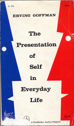
Erving Goffman

Erving Goffman was an Canadian writer and sociologist who was born on 11 June 1922 and died on the 19th November 1982. Erving was most known for writing his book ‘The Presentation of Self in Everyday Life’ which was published in 1959. Erving believed that when an individual comes in contact with other people, that individual will attempt to control or guide the impression that others might make of him by changing or fixing his or her setting, appearance and manner. At the same time, the person the individual is interacting with is trying to form and obtain information about the individual. The image below is of his book and I have added an quote from the book.
“And to the degree that the individual maintains a show before others that he himself does not believe, he can come to experience a special kind of alienation from self and a special kind of wariness of others.”
― Erving Goffman, The Presentation of Self in Everyday Life
Task 3:
Original Research: Street Photography
Henri Cartier-Bresson & JR
Henri Cartier-Bresson
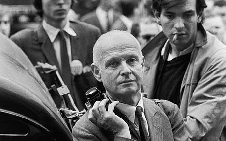
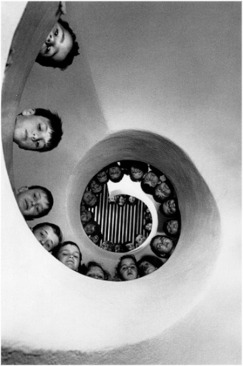
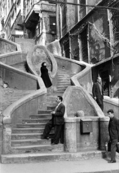
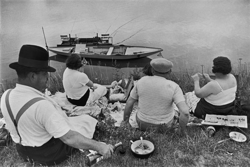
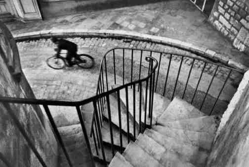
Henri Cartier-Bresson was a legendary French street photographer who is praised for developing street photography. Born on August 22nd 1908, Henri first started taking interest in photography when he studied at private art school as well as Lhote Academy. Henri’s body of work has created a legacy amongst all types of street photographers. When I look at Henri’s work I feel that all of his photographs tell a story of whatever event is happening at the time that he photographed it. I feel that he manages to capture the atmosphere perfectly. When I was conducting original research, I decided to use Henri and his work because I found his work amazing and very inspiration especially when it came to my work. I have incorporated some of his work into my work meaning that his work highly influenced my portrait piece. Henri sadly passed away on August 3rd 2004.
Here is some of Henri’s work:
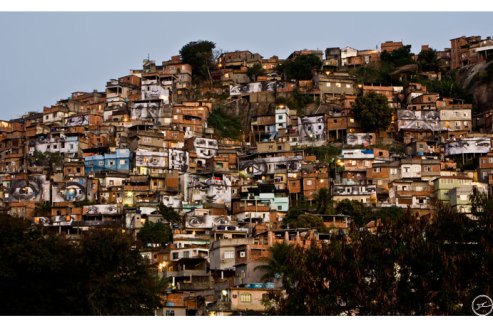
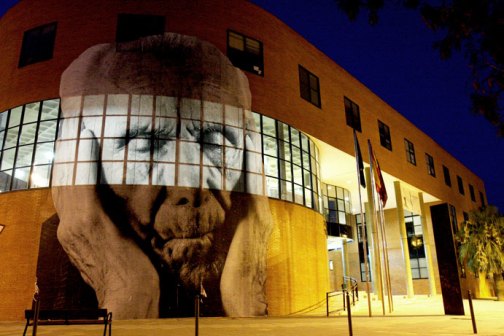
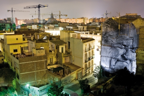
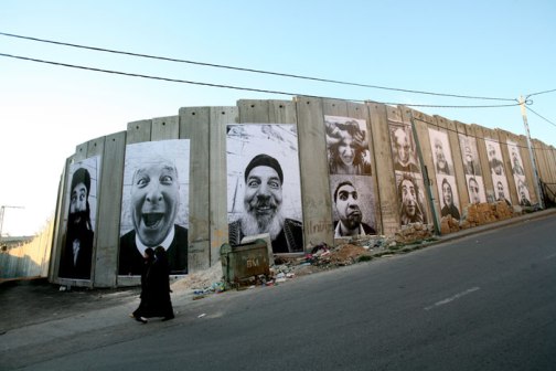
JR
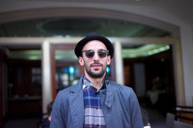
JR is a French street photographer who field mainly flows around street art, photography and graffiti. Born on February 22nd 1983, JR started taking interest in graffiti by mainly targeting subway stations and high buildings. JR started photographing and displaying some of the graffiti that he designed himself. JR’s body of work is very much different from Henri’s. When I look at JR’s work, it’s mainly focused on landmarks and buildings. JR has a famous style of photographing and editing that he does which has made his work legendary. JR fly posts large black and white photos into the environment of the photo that he has taken. When I was conducting original research, I decided to use JR and his work because I found his work was completely different from any other street photography photos I had seen. I have incorporated some of his work into my work.
Here’s some of JR’s work:
Project Profile: Britannia – A Portrait of London
[Project Name] : Britannia – A Portrait of London
[Theme] : London Culture, Street Photography
[Aim] : For the audience to gather there own thoughts. When looking at the photos, tell me what you think and feel about the representation of London.
[Tools] : Photography > Duration (1 to 2 Minutes)
[Synopsis] : A Collection of portrait images that represent and showcase London. Using portrait photographs of famous landmarks in London, different places as well as including the general public.
[Inspiration]: Inspiration behind the portrait images were street photographers Henri Cartier-Bresson and JR. Also the London Street Photography Festival 2012.
http://prezi.com/voquwr4kyfsa/britannia/?kw=view-voquwr4kyfsa&rc=ref-24998999
Evaluation for Britannia: A Portrait of London
As part of our Portrait Assignment, I was asked to produce and develop an original idea based on my own original research. The tools I was aloud to use were either to be a photography based portrait or a video based portrait. The portrait piece had to include no sound and the duration could either be long or short. My original idea was street photography. I wanted to produce a photography based portrait piece which showed a collection of images that represent and showcase London. I wanted to include portraits of famous landmarks and places in London as well managing to capture the essence and atmosphere of London altogether.
I started of this process by researching street photography and looking for different image ideas. I knew that I wanted my idea to be based around London so I also decided to research London Street Photography as well as London culture and famous London landmarks. The theme of my portrait piece was London life. From my research I discovered that there were a lot of street photographers that have photographed some of the world’s most famous landmark buildings as well as photographing the general public. Two street photographers that I came across when I was researching were Henri Cartier-Bresson and JR. They both have very different styles of street photography. I personally find Henri’s style of street photography to mainly capture whatever is happening at that particular moment. Most of his photos express whatever is happening within that moment. I feel that the emotion is captured more because the photograph is black and white. The big difference between JR’s artwork and Henri’s is that JR’s work firstly is shot in colour however he keeps some items or parts of his photos black and white. Unlike Henri, JR captures any and everything in the photo. I wanted to take a little something from both Henri and JR and then incorporate it into my street photography piece.
Upon looking at Henri and JR’s work I decided that I wanted to do splash effect on my portrait photos. I want the background of my portraits to be black and white and highlight one thing from my photo by only having the colour from that item being featured. After I finished researching I then wrote down a plan of where I wanted to go in London to shoot my pictures and then I started the production process by going out and take these photos. I borrowed the Canon 450d camera from the technician George and went off on my journey. The first place I went to was Kings Cross. I didn’t take many photos in Kings Cross only because I knew that when looking at back the photos it wouldn’t have been as recognizable as some of the other photos that I was preparing to photograph. The second place I went was Tottenham Court Road. I felt that Tottenham Court Road would be one of the best places to shoot my photos because it is one of the major roads in Central London and is constantly busy. The main reason why I chose Tottenham Court Road is because one of the worlds most popular and loved celebrity figures has a huge statue in honor of him and the West End musical We Will Rock You. The statue is of Freddie Mercury; a legendary British musician who was a true British Icon and was lead of singer of one of the best British bands of all time Queen. I definitely knew that I was going to photograph the statue because to me it definitely screamed British.
The third place I went was Oxford Street. I knew that I would definitely discover things that represented Britain. Whilst on Oxford Street, I managed to photograph so of the iconography in London like a double decker bus and black taxi’s. The amazing part about photographing the black taxis was that I knew when I was going to Photoshop the image, the black colour would not appear in the photo so I decided to not focus so much on photographing black taxi’s but photograph the colored taxi instead. So whenever I saw the Union Jack inspired taxi or a Reese’s chocolate inspired taxi I had to photograph it. The fourth place I went was Marble Arch. The fifth and sixth place I went to was Regent Street & Piccadilly Circus. This was the main place where I knew that the photos that I was going to take would be phenomenal. Piccadilly Circus is such an iconic place for London and is a well known place amongst tourists. There was one thing in Piccadilly Circus that was the main thing that I wanted to photograph and that was the illuminated signs in the lights. The big lights and advertising signs is a main part of London and so I made sure that I photographed that from every angle that I could. Amongst the lights I also photographed the street name sign. Finally, the last place I went to was Westfield White City. I only managed to take two photos whilst I was at Westfield White City. I was disappointed that I was only able to take two photos because Westfield has sort of become an iconic place to go in London.
After I had finished taking the photos, I had the task of selecting the photos which I thought was perfect for my portrait piece. As I went through all my photos I noticed two things. The first thing I noticed was that there are a lot of things in London that have the Union Jack featured on them and the second thing I noticed was that the atmosphere within the photos were very calm and relaxed which is unexpected of London considering that its usually very busy. When I looked back at the photos, I definitely felt that the aim that I was trying to achieve was achieved. I wanted to showcase London and all that comes with it and I definitely felt like I did that.
In order to create the splash effect look on the photos I had taken, I had to use Photoshop. Weirdly enough, I found the Photoshop process quite easy considering that I usually have a little bit of trouble when it comes to using Photoshop. To create the splash effect look I had to firstly open Photoshop, then I had to open file and add the photo which I wanted to create the splash effect on, then I had to go to layer and click duplicate layer then I highlight over the whole image and close the layer and then click on image > adjustments > black & white and then ok. After this I then had to select the eraser tool and erase the object that I wanted to highlight. I completed this process on all of the photos that I selected to be in my portrait. I wanted to highlight things in the photo that I thought stood out the most and I think I definitely did that.
Overall I am 1000% pleased with the work that I have produced for this task. In the beginning I wasn’t to sure about the idea that I had but I knew that if I stuck to it and put all my energy, creativity and focus into the project then it would turn out exactly how I wanted it. When I started planning my idea, I knew that I didn’t want to create a conventional portrait of someone’s face. I wanted to think outside the box and do a portrait piece on something that I love and means a lot to me that is why I chose London.
Task 4
Ballerina Stop-Motion Portrait Video
As part of our Portrait Assignment, I was asked to produce and develop an original idea based on my own original research. The original based idea that I produced was my second project, which focused on me taking a stop-motion piece of a ballerina ornament, which belonged to my mum. The tools I used when creating this stop motion video was a Canon 450d camera. This portrait piece included an instrumental track from singer Gotye on his 2012 hit song ‘Somebody That I Used to Know’.
My original idea was to create a video piece portrait of my older sister Shadeeka performing a choreographed ballet dance. The point of this video portrait was to focus on the performance of body movement within her dance. I also wanted to focus on her facial expression, as I wanted that to be the key focus within the video. Unfortunately, my sister was unable to create the dance and perform for my project piece so I had to substitute for her not being able to do it. Whilst I was in the process of taking photographs for the task 3 project, I came across this ornament piece, which belonged to my mum, which was designed with a ballerina sitting on top of a platform and a carpet. I instantly came up with the idea to do stop motion so I took the camera and took roughly around 20 to 25 shots of the ornament. Each time I took a photo of the ornament, I moved the ornament by maybe two centimeters and then photographed that position that it was in. I repeated this process until the ornament was back in the position that it was in the beginning.
After I finished taking the photos, I checked them just to make sure that they looked okay and were useable. Because the task 4 project was meant to be a video and I was planning to do it in stop motion I had make the video via Final Cut pro.
Firstly, I opened Final cut Pro and imported the photos that I took of the ballerina ornament. After this I positioned all the photos in the timeline in the correct order and then I started to edit the project. I shortened the photos and changed the speed so that when you played back the video, it didn’t take long when you played it back. Then I decided to add some music into the video so I went to YouTube and I searched for the instrumental version of Gotye’s 2012 hit ‘Somebody That I Used To Know’. Then I downloaded the song and imported it into Final Cut Pro. After this I render the sound so it allowed me to be able to play the video. At this point I personally felt that I had finished my video piece.
Overall I am very pleased with how my video turned out considering that I produced it in a short amount of time. I feel that I done an excellent job capturing the portrait of the ballerina ornament piece. When I first thought out the idea of what I wanted to do for my video piece, I had arranged to do a video about body language within dance and I wanted my sister to showcase that in a choreographed dance piece but that never happened. Considering that I didn’t have much time to do this project I believe I did well.
Galleries
Bertozzi & Casoni – Regeneration

As an additional part to our exploratory and portrait assignments, we have to visit different galleries which will help us with our research and ideas when it comes to the assignment. I visited the Bertozzi & Casoni Regeneration Gallery, The National Portrait Gallery and The Saatchi Gallery. Upon our visit to the Bertozzi and Casoni Regeneration gallery we saw some very interesting pieces of artwork. Each piece of work showcased something different and had a different expression to it. After exploring the art for 10-15 minutes we spoke to one of the guys who works and helps run the gallery. He told us all about what the art stands for and how much some of the art pieces sell for. Whilst there, I took some pictures of some of the portraits and art that we on exhibition. You can see some of the images from each gallery below.


National Portrait Gallery

As an additional part to our exploratory and portrait assignments, we have to visit different galleries which will help us with our research and ideas when it comes to the assignment. I visited the Bertozzi & Casoni Regeneration Gallery, The National Portrait Gallery and The Saatchi Gallery. Upon our visit to the National Portrait Gallery we saw some very interesting portraits. Each piece of portraits showcased a different expression and situation. We explored the gallery for 30 minutes and then left. Whilst there, I took some pictures of some of the portraits that were on exhibition. You can see some of the images from each gallery below.


